
studio kohl
Kohlin' the shots since 2013
Work enquiries only at [email protected]
Recent Posts
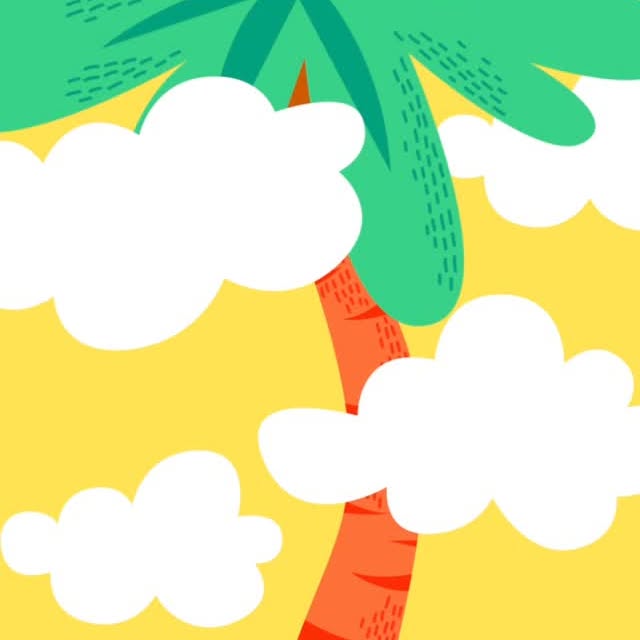
Mass Snap for Puthandu 2022 Client: Snapchat Concept: Mira F Malhotra, Pearl D'Souza Illustration: Pearl D'Souza Animation: Pradhyumn Kag, Irregulars Alliance @kokumkohla @pearl.dsouza @pradhyumnkag @irregularsalliance
Insights on Book Cover Design 1 Having to read the whole book to design a cover is a myth! People often ask what the book cover design process is, and much of the time I’m asked if I’ve done the arduous task of reading the whole book cover to cover. That is actually a really overwhelming way to take a brief, because the cover doesn’t really have to represent the whole book. Often you have the author on board, and always the editor. If it's a reissue of an old book, we are most probably looking at what the book means in contemporary times, or how we can avoid how it’s been represented before. In the case of a fresh text, there may be something incisive as to why it’s relevant today, or some point of interest, a pivotal scene that helps sell the book, or draws the potential customer. 2 Speaking of which, classics and new books are very different to design. Sometimes I joke, that dead authors are my favourite, because a classic usually has less people (editor and designer) deciding what needs to be done, and you aren’t starting from scratch. The challenge with a classic though is you have to avoid the stereotypes, and everything that’s been done before- and often you’re contemporising the cover. 3 When I’d put out some of these book covers, sometimes a question comes up from people who look at the work, of who should get to design the book covers? Shouldn’t artists from that particular religion or affiliation where the author comes from, design it? Yes and no. In some cases if the work feels like it belongs to a certain larger group, it is not necessary, and in some cases it may be absolutely necessary. These are tough calls to make, and sometimes on the face of it, it may look like an artist or designer is overstepping boundaries, but there’s a lot of commercial and administrative factors that go into a decision like this-- but that doesn’t mean we shouldn’t do better. Did we make mistakes designing some of the stuff we designed- maybe. Did we have control? Oftentimes, no. and in those cases, we simply do the best we can, by informing, rehashing or making sure it’s not offensive. – Mira F Malhotra
DESIGN HERSTORY Repost from @devout_hand An ode to the icon that is Susan Kare! ☆(^o^)乂(^-^)☆ something I find so amazing is the fact that we can see the original graph paper and sketches Susan used to eventually create the icons we grew up seeing on screens! imo this translation from analog to digital really shows how relevant early art forms have been in the digital age [Voiceover: Did you know emojis were originally inspired by crafts like needlepoint and mosaics? If you’re interested in design and computer art, you’ve probably heard of Susan Kare: a pioneer of pixel art who’s celebrated as one of the most significant designers of modern technology. When Kare was asked to design icons to make the Macintosh interface more user-friendly, she knew little about computer graphics. Luckily, she was able to draw inspiration elsewhere. She found that pixels really weren’t that far removed from other forms of art – some of which dated back thousands of years: > “I still joke that there’s nothing new under the sun, and bitmap graphics are like mosaics and needlepoint and other pseudo-digital art forms, all of which I had practiced before going to Apple. I didn’t have any computer experience, but I had experience in graphic design.” > Armed with little more than a $2.50 grid notebook, a pencil, and her knowledge of crafting, counted-thread embroidery and fine art, she sketched up 32x32 pixel representations of the required software commands and applications. Kare also developed new font sets for the Macintosh, and in addition to Chicago and New York, she created “a set of fun modern hieroglyphics” called Cairo. This font set — composed of images ranging from a palm tree to a handgun — was meant to provide an easy way for users to combine images with text. This was essentially the first visual language translated into pixels – aka, a frontrunner of what would later be known as emojis.] #susankare #designhistory #needlepoint #crafting
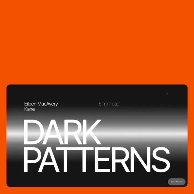
SPEED READS 👀 📖 A place where ethics get murky. Take a dive into the universe of dark patterns. We love this piece by Eileen MacAvery @eileenmacavery originally commissioned by @readymag for The Ethical Issue. Dark patterns are online user experiences that are intentionally designed to trick users into taking unintended actions. These actions rarely benefit the user, but rather serve the owner of the site or app — almost always for financial gain. Read at the link in bio. #readymag #ui #ux #darkpatterns #eileenmacavery

Mass Snap for Bohag Bihu, Assamese New Year Client: Snapchat Concept: Mira F Malhotra, Pearl D'Souza Illustration: Siddharth Bhatia Animation: Pradhyumn Kag, Irregulars Alliance @kokumkohla @siddychan @pearl.dsouza @pradhyumnkag @irregularsalliance
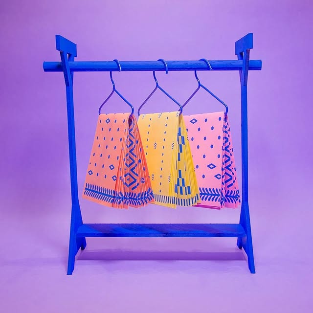
UNFOLDING THE SAREE ✨ First printed in 2016, this riot-grrrl inspired zine is a humorous visual essay on the Madonna Whore phenomenon through the lens of the saree. Is the saree an epitome of female beauty and purity for the sati-savitri, or a raunchy, sexy outfit that reveals and hides in turn? A saree miniature on a teensy hanger, the zine has a pallu and saree pattern on one side, with the essay on another. Now available at @nobordersshop Link in bio. #unfoldingthesaree #studiokohl
The festive season is upon us! Wishing you a season full of warmth, love, light and happiness. 🪔 🎇 🕯️
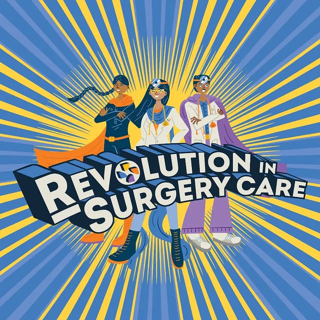
Drawing inspiration from @pristyncare_surgeries' s logo, our team creatively transformed the recognizable sector shape into characters that now grace their office murals. By elongating the sector shape into limbs, we brought these characters to life. These characters, represent the diverse Pristyn care community, in a spectrum of skin tones, clothing, and accessories. The murals capture the fusion of brand identity and cultural inclusivity, turning Pristyn Care's workspace into a vibrant canvas of unity and diversity. Client: Raunaq Singh Suruchi Rohani Prateek Joshi Team: Creative Direction: Anant Ahuja @typethug & Mira Malhotra @kokumkohla Illustrators & Graphic Designers: Nandini Negi @colourfulmonochromeness , Arsh Bedi @bedi.arsh, Pearl D’souza @pearl.dsouza & Priyal Surana @priyalssurana Project Manager: Hinal Kikani @hinalkikani #illustrationdesign #wallmurals
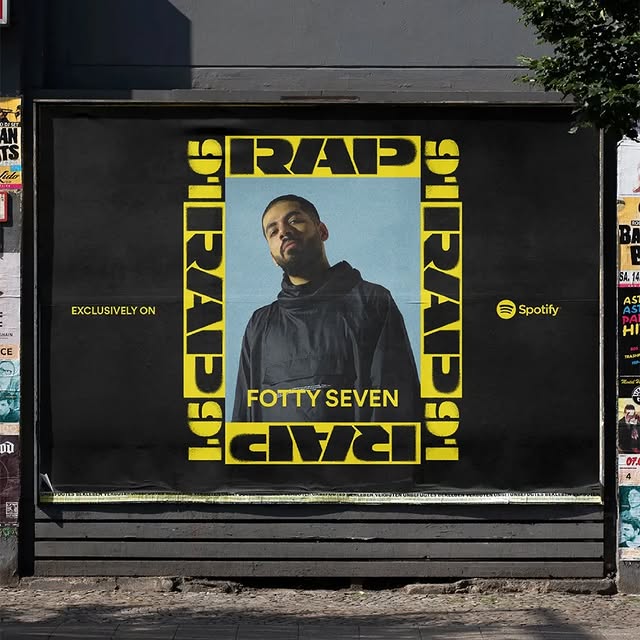
We teamed up with Spotify @spotifyindia to create the identity for Rap91, a Spotify playlist featuring the finest hip-hop tracks from India. Here's Arsh @bedi.arsh from the team sharing his experience of working on the identity: "The challenge of representing the diverse Indian hip-hop scene added an intriguing layer to our creative journey. We dedicated ourselves to crafting an authentic unit that resonated with the essence of India, encompassing every facet of the vibrant hip-hop culture. The incorporation of a rough texture and stencil effect played a pivotal role in successfully depicting the raw, Gully aspect of Indian hip hop. We aimed to strike a balance between an international appeal and a distinct Indian identity, creating a design that is bold, hard-hitting, and graphic – a true reflection of the diverse hip-hop scene in the country." Team Spotify: Michelle Pham Shahin Haghjou David Karlson Team Irregulars Alliance & Studio Kohl @irregularsalliance @studiokohlindia Mira Malhotra @kokumkohla Anant Ahuja @typethug Pradhyumn Kag @pradhyumnkag Hinal Kikani @hinalkikani Arsh Bedi @bedi.arsh Priyal Surana @priyalssurana #identitydesign #brandidentity #creativestudio
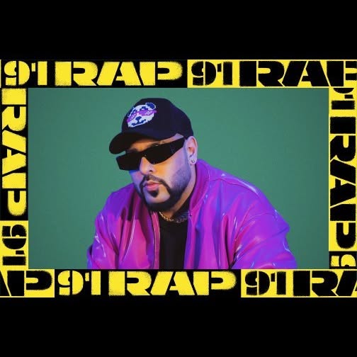
Cautioning the city with two colours that signify the streets, caution tapes, and that🎙️ famous hip hop tune!🚧 For @spotifyindia 's Rap91, the visuals were kept fresh with artist photograph cut-outs imposed against select background colours, featuring the logo in all its forms - horizontal strip, patterns and frames.⚡ Our meticulously crafted two-toned lockup facilitates play, versatility and effortlessly infuses energy into motion graphics. Team Spotify: Michelle Pham Shahin Haghjou David Karlson Team Irregulars Alliance & Studio Kohl @irregularsalliance @studiokohlindia Mira Malhotra @kokumkohla Anant Ahuja @typethug Pradhyumn Kag @pradhyumnkag Hinal Kikani @hinalkikani Arsh Bedi @bedi.arsh Priyal Surana @priyalssurana Animation : Ankit Gajjar @the_art_voltage & Arsh Bedi @bedi.arsh #identitydesign #brandidentity #designstudio
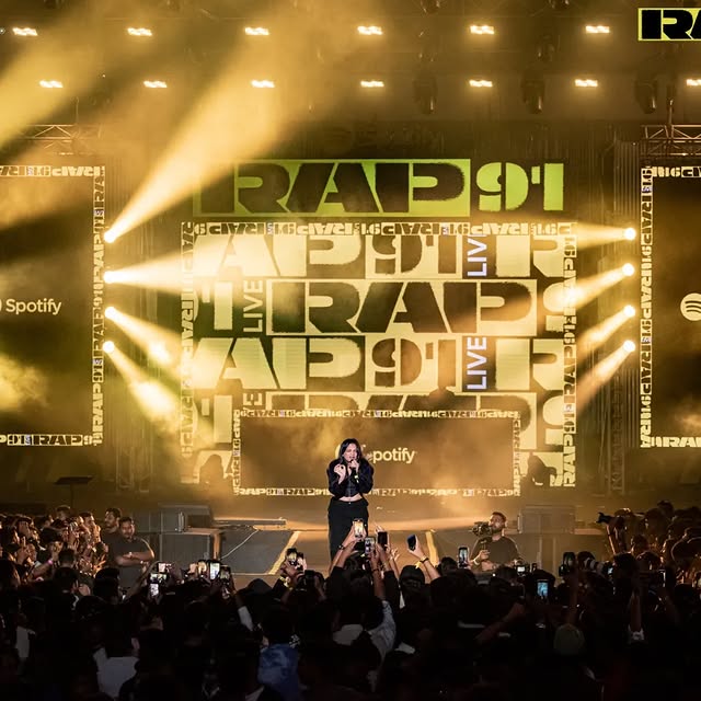
We teamed up with Spotify @spotifyindia to create the identity for Rap91, a Spotify playlist featuring the finest hip-hop tracks from India. A fast growing genre, starting from street culture, brewing a loyal and passionate following. We were absolutely electrified by @aaquibw 's and @fourbyfourexp ‘s teams’ on-ground execution of the identity! The event was a thrilling blast, and being there with the entire team in person to experience our identity coming to life was nothing short of spectacular. More on our off-site adventures later, here's Mira sharing her experience about working on the project: "It's really exciting to get a brief like this, to successfully encapsulate all of India's emerging hip-hop scene into one cool playlist cover. We worked on really getting a tight unit, with a gritty, raw, authentic street feel to it, that felt both international but also uniquely Indian. It's bold, hard-hitting and graphic - which truly represents the scene." Mira Malhotra @kokumkohla @studiokohlindia Team Spotify: Michelle Pham Shahin Haghjou David Karlson Team Irregulars Alliance & Studio Kohl Mira Malhotra @kokumkohla Anant Ahuja @typethug Pradhyumn Kag @pradhyumnkag Hinal Kikani @hinalkikani Arsh Bedi @bedi.arsh Priyal Surana @priyalssurana Image 1: Courtesy @themoneta #identity #hiphopmusic #creativestudio

Images: ICC & Witekite We are super excited to have been part of the team that developed the branding concept for the ICC Men’s Cricket World Cup India 2023, acting as cultural consultants to WiteKite. The theme of the identity is all about celebrating the 'Navarasa' – the nine powerful emotions that are experienced in the theatre of life. For the largest stage in world cricket, we helped craft a unique navarasa, nine emotions that expressed the heart and soul of our favourite sport. Inspired by the rich heritage and vibrant colors of India, the visual identity transports fans to a modern world of bold expression, our unique culture, and the essence of our unmatched love for cricket that unites ten nations and millions of passionate cricket lovers around the world. Witness the electrifying spectacle where legends are born, one-day cricket at its absolute peak, and a tidal wave of emotions engulfing every stadium! The ICC Men's Cricket World Cup India 2023 is in full swing, and we're absolutely pumped to be part of this exhilarating fusion of sport and culture. #CWC23 #CricketEmotions #Witekite #StudioKohl #IrregularsAlliance #Collaboration
Similar Influencers

Infinite Studios

Kabaria of th3 world💤💤

zhuhua

₥ɆɆ₦₭ØØ₭ 🍷😒😎

早报 zaobao.sg

June Monstera

Lauren Hamilton

This is Suzhou

jojo
Frank骆实🇨🇳

D. Thomas Miniatures

Manuel Graça Dias

LIZ | 🇦🇹Expat in Hong Kong 🇨🇳🇭🇰

Rohan Jagadeesh IPS

Shahbaz Ahmed

Francis Tung

JJ 詹朗林

Curadoria de Literatura | Asian Literature Curatorship

Business of Animation

Paws & Pixels

Ruchika Arya

Melia Liyun

Tania Balaji 🧿

DIGITALCONFEX

Vee 💜 | TRAVEL • LIFESTYLE

Carly & Lennon 〰️ IVF Solo Mum by Choice ♡

Mrs Sambavam(chinchu)

(Adelyn) Tan L.Thing

Su Lin Ang
